Information/Instructional Design Definition and Examples

Information/Instructional design is the detailed planning of specific information and the systematic process by which instructional materials are designed, developed and delivered. Some examples of these:

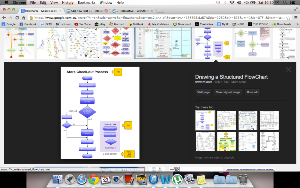
Flow Charts

Flow charts are easy-to-understand diagrams showing how steps in a process fit together. This makes them useful tools for communicating how processes work, and for clearly documenting how a particular job is done. Furthermore, the act of mapping a process out in flow chart format helps you clarify your understanding of the process, and helps you think about where the process can be improved.

Screen Shot 2013-03-23 at 10.20.15 PM

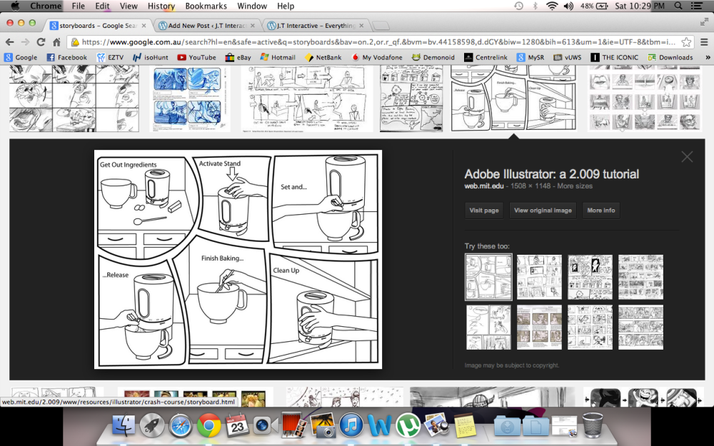
Storyboards

Storyboards are graphic organisers in the form of a sequence of drawings, typically with some directions and dialogue, representing the shots planned for a motion picture, animation, motion graphic or interactive media sequence.

Screen Shot 2013-03-23 at 10.29.11 PM

Step by Step Descriptions

The step-by-step procedure is the heart of any operational process. It is a description of exactly how to do what you want to do. For example:

Screen Shot 2013-03-23 at 10.33.03 PM

Interactive Design Definition and Examples

Interaction design aims to define and facilitate interaction between human beings by means of a product or a service. It focuses on the possibilities to create and encourage behaviour facilitating an exchange between people. A few examples of Interactive Design:

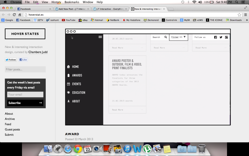
Award Website

Sparing use of CSS animation and really well considered rollovers make for a snappy feeling UI on the Award site.

Screen Shot 2013-03-23 at 9.40.21 PM

Screen Shot 2013-03-23 at 9.39.17 PM

Screen Shot 2013-03-23 at 9.40.07 PM

Kids Health: Just For Kids Website

Our experience with interactive design starts early. Educators know that people absorb information better when they are actively engaged in the process.

Kids Health run by The Hospital Sick Children in Toronto has managed to make health issues, entertaining through the use of interactive ebooks, multimedia videos, quizzes and heaps and heaps of games on their site.

Screen Shot 2013-03-23 at 9.57.11 PM

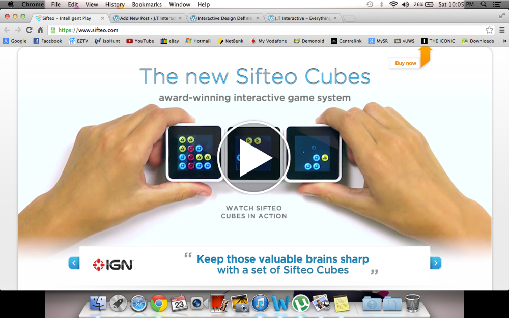
Sifteo Cubes

Sifteo cubes are like Lego bricks for the 21st century. The cubes communicate wirelessly to respond to each other and your gestures. The 19 games blend physical and digital interaction. The brainteasers engage kids more than mere button pushing or screen tapping. This is one great example of Interaction Design.

Screen Shot 2013-03-23 at 10.05.41 PM

Web 2.0 Definition and Examples

Web 2.0 is used to refer to a new generation of websites that allow users to interact and collaborate online with each other, in contrast to websites where people are limited to the passive viewing of content. Some examples of Web 2.0 are seen below:

Facebook

Facebook is a social utility that connects people with friends and others who work, study and live around them.

Screen Shot 2013-03-22 at 5.22.41 PM

Blog

Blog, as the name already states is a free blog hosting service which allows users to share and upload media onto their own personal blog.

Screen Shot 2013-03-22 at 5.24.55 PM

Youtube

Youtube is a video-sharing website, in which users can upload, view and share videos online. Unregistered users can watch videos, while registered users can upload an unlimited number of videos.

Screen Shot 2013-03-22 at 5.27.00 PM


Lecture 5: Interface Design Review

What is an interface?

  • A common boundary.
  • Between things.
  • A point of interaction. Not interaction itself. The interactive experience depends on an interface but is a whole ecology in itself. Interface is within interaction.
  • Medium across which data passes.

Interactivity has been one of the key value added characteristics of new media where old media offered passive consumption, new media offered interactivity. 

Interactivity: Ideologically and Historically

Old Media = Passive Consumption

  • For example, like watching television. You sit there and consume. One producer to many viewers, one to many.

New Media = Interactivity

  • Interactivity and new media being more aligned with many users collaborating with each other, or many to many as opposed to one to many. Web 2.0, social media and sharing have brought the idea of new media forward. Generally the term stands for a more powerful sense of user engagement with media text, a more independent relation to sources of knowledge.

Contemporary Interactivity: Interface Design Within Four Prominent Threads:

– Hypertextual Navigation

  • The user must use the computer and software to make reading choices in the database (Can be anything from the entire world wide web to a particular learning package, an adventure game or the hard drive on your pc.) The end result of such interactions will be that the user constructs for him or herself an individualised text made up from all the segments of text which they call up through their navigation process.

– Immersive Navigation

  • Hypertext = Extractive
  • Representations of space = Immersive
  • Immersive Media = Hypertext + Represented Space (E.g. Virtual reality, simulations and games)
  • (Hypertextual Navigation is extractive so we go and extract it as an outsider. However when we move from seeking to gain access to data and information, to navigating representations of space or simulated 3D worlds we move into this idea of immersive interaction, we are essentially immersed in or embodied by the interface.)

– Registrational Interactivity

  • To ‘write back into’ collective information
  • Examples: Updating Facebook, leaving comments on blogs, re-tweets, video responses and wikis, etc. This interactivity depends on other users in a collaboration and a system to freely allow collaboration via the user being able to write back into the interactive experience. A concern with Registrational interactivity is that the user forgoes control of information once it is entered into a system.

– Interactive Communications

  • Based on face to face human communication so we draw parallels or compare and contrasts from that standard or person to person connection. For example: A forum post would be considered less interactive than a live chat site. It’s the continuation of face to face storytelling, basically in a digital context.

Fundamentals of Screen Based Interactive Design Production

Visual-spatial thinking/Gestalt psychology:

  • “Visual thinking comes from the field of Gestalt psychology, which argues that humans respond, organise and assign meaning to elements in their visual field. This approach considers how users conceptualise functional wholes from the individual elements they perceive in the visual field”

Using Fundamentals or Principles:

  • Principles serve as broad guides
  • Draw on design theory
  • Emerge from print or poster design guidelines
  • User perception

6 Fundamentals/Principles:

1. Visual Focus

  • Use improved figure-ground contrast to signal which elements users should focus on.
  • Use animation and rollovers in navigation toolbars to indicate functional or clickable items.
  • Give contextual and visual cues greater visual distinction.
  • Develop style sheets that specify similar formats for level headings and spacing between text chunks.

2. Problem Solving

  • Highlight potential pathways to readers by using breadcrumb trails, site maps, indices and headers.
  • Develop navigation toolbars that suggest information pathways to users, which don’t just outline content.
  • Provide multiple navigation tools and choices for readers such as toolbars, search fields, drop-down lists, site maps etc.
  • Consider time in your design. Don’t make things take too long and provide alternative options like ‘skip’ buttons to allow the user to move past animations and solve their problems quicker if they want to.

3. Contextual

  • Place more contextual information, such as visuals cues, in higher site levels.
  • Provide detailed content in lower site levels.
  • Use shaded regions, tables, frames or other methods to anchor navigation tools in consistent locations.
  • Place content no more than 5 to 7 links or clicks from users, so content is not placed too far from users.

4. Conceptual

  • Use familiar icons, shapes and graphics that rely on prior user knowledge.
  • Place graphics in familiar contexts.
  • Provide text tags for images used in new contexts.
  • Use design metaphors to help users comprehend the arrangement and content of visual spaces.

5. Wholeness

  • Group related content using visual shapes, such as shaped boxes or rules, or by using space.
  • Use figure-ground contrast and grouping to help users identify relationships between elements.
  • Use breadcrumbs, site maps, indices, etc. to help users identify the sites structure (and filter information.)

6. Linear/Nonlinear

  • Linear Approach: Pages are only available in a straight line. For example, you can’t get to the last page from the first. The user is forced to go through the middle page to get to the end and back around to the start again. Essentially the user becomes trapped, and it is at this point in traditional web browser scenarios that the user goes for the browsers back button, or leaves the site frustrated and never to return.
  • Nonlinear Approach: Allows all pages to be accessible from every page.

Lecture 4: The Static and Kinetic Screen

Relating principles of static composition and visual hierarchy to contemporary definitions of interactive design.

Static: Is where things in print or on screen don’t move. It might take us time to read or scan an image, but within a reproduction, elements don’t move.

Kinetic: Relating to change over time or motion. When you hear kinetic in a discussion of media or interactive design, elements moving on screen or the change over time of an interactive product is normally the focus.

Andrew Polaine: Who is he?

Polaine describes himself as “an experienced designer focusing on playful interactions and service design research” within this idea or field of interactive concept development.

Interactivity through the concept of ‘play’

Play > Experience > Design

Polaine’s definition of interaction/interactive design:

“It is a combination of how the elements function:

  • What they do (What does your interactive do, the purpose and function of an interactive)
  • What they look like (What does your interactive look like)
  • What they look like they do (What does your interactive look like it should do)
  • The experience of using them (The experience of actually sitting down and using or the there and now of and interactive)

In many cases it’s about making complicated things easier and more pleasurable to use.”

What these considerations suggest is that interactive products or artefacts are complex and demand complexity in the design processes involved in producing them. Demanding that we combine an understanding of many design disciplines into our own personal design capacities.

Polaine, Andrew. “Any Polaine.” Desktop 251 (2009): 30-31

Considering Static Composition

The user’s gaze is still an integral element of usability especially with screen based media.

  • User = All senses and capacities, especially sight.
  • User = View + Use

The composition of graphic form is in fact user interface and interactive that requires consideration to improve usability and the relay of information.

Visual Hierarchy

In a static graphic sense, it’s the consideration and treatment of graphic or visual forms on a page; the screen. It is not only the treatment though, it’s also the relationship and effect these elements or forms have on each other.

Visual Hierarchy should always be considered as it is a vital part of the craft of being a graphic designer.

The principles of relaying information are shared by all fields: Graphic Design > Information Design > Interactive Design.

Considering points of interest and levels of visual information:

Composition is visual ecology:

  • A point of interest should not overtake a whole composition
  • A point of interest should not be too weak and hidden
  • No right or wrong, only appropriateness to purpose or brief.

Methods in dealing with Visual Hierarchy

Point of interest – The focus or draw card of a composition, usually the most important element of a composition. The entry or starting point of reading or digesting the visual information in a layout. Leader of visual hierarchy.

Contrast – Is the difference between visual elements within a work. The relative difference between light and dark areas.

Tone – The relative lightness or darkness of colour. Used whilst considering contrast. It helps establish contrast. Tone or the difference in tone is used to strengthen or weaken a point of interest.

Scale and weight – The relative size of graphic form; where the eye is lead through the composition via the dominants of size possessed by graphic form or graphic forms. Closely related to perspective and depth.

Visual hierarchy can also be established via the use of colour.

Typography or the use of type – There are two main concerns:

  • Legibility – How clear the text is visually
  • Readability – The degree to which meaning of text is understandable, visually and conceptually. Readability is not legibility.

Lecture 3: Interactive Design Process

Nathan Shedroff’s Diagram (Experience Design 1, New Riders, 2001) models the process of communicating and understanding. It’s describing the flow from data to wisdom.

Interactive Design Process Overview

Pre-project: The development process itself is actually wrapped in a management  layer responsible for the meeting of deadlines, schedules, budgets and the building of teams and relationships. During this phase, several members of various teams may be involved but the goals are to create or respond to the request proposal that succinctly outlines the needs of the project from the clients views, this is a bit like the brief.

Concept and planning: The first real development towards a solution takes place during the concept and planning phase. This is where the goals, messages and audiences for the project are explored and decided. These are the most important questions that must be addressed and make the most impact on the project.

Design Prototype and Specification: In this phase the first examples and solutions are derived. It’s the most intense complex phase and involves the most creativity, coordination and inspiration. This phase is where the development team develop the answers about how in other words, the solutions. This phase will see the developments of many prototypes, often the first merely in paper and sketches.

Prototypes are examples and not the final solution, they’re usually hand coded, they don’t actually work as intended, only appear to.

These prototypes should be tested with potential users to determine if they really meet the needs of the audience. It is essential that the functions are tested and problems are corrected.

Production: At this stage, all answers should’ve been answered by the functionally and specification prototype. As the project comes together it can be built into temporarily working instances called builds. These builds will go through many iterations before complete, often labelled alpha 1, 2 , 3 etc. When production has finished, the project isn’t yet, it still needs to be tested and made live. At this point everything should be finished and integrated into the beta build.

Testing: This is the phase that is most likely forgotten, understaffed, under-scheduled and under budgeted. It is essential that everything is tested before it’s made live.

Interactive Design Process – User Personas, Artefact Personas and User Scenario

Personas

Personas are fictional archetypal users. The genius of the personal methodology isn’t the idea of directing your communication towards an archetypal user. The genius is that it requires you to fake and record and articulate who that archetypal user is, so you can make informed conscious and consistent design decisions and this is important.

So from this point of view you can’t do interaction design without personas because designing in the absence of conscious, articulated vision of the audience isn’t really design.

Every successful design starts with an understanding of who will use the product. You need to start with quality of research then look for patterns and behaviours and goals among the people you interview. Then out of these interviews you create fictional archetypal users or personas who have the same concerns and goals. Personas guide the design from begin to end.

What is a scenario?

A scenario is a narrative describing foreseeable interactions of types of users (characters) and the system. Scenarios include information about goals, expectations, motivations, actions and reactions. Scenarios are neither predictions nor forecasts, but rather attempts to reflect on or portray the way in which a system is used in the context of daily activity.

To develop a product persona these are the kind of questions you could ask to get an idea of the desired personality of the thing you’re designing.

Product personality questions:

  • If the interface were a person, what would she or he be like?
  • How would you expect users to react when they first view the product?
  • How would you describe this product to a friend?
  • How is the product different from competitive products?
  • Which celebrity (or car, movie etc.) is the product most like? Least like? Why?

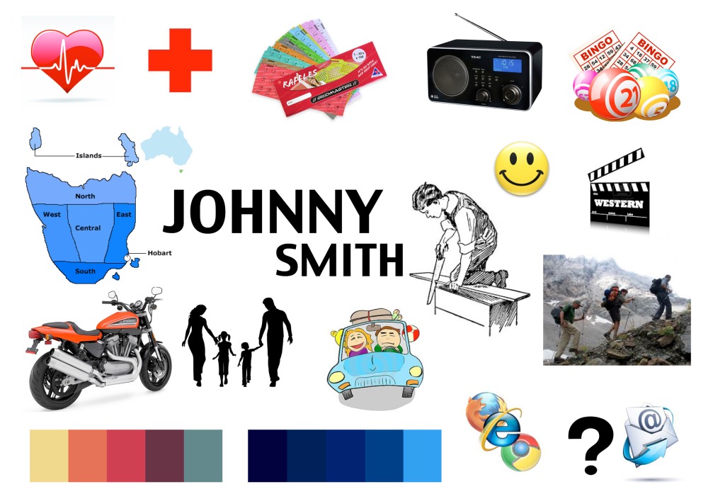
Persona Moodboard – Johnny Smith

MOODBOARD1

John is a 75-year-old retired carpenter who still enjoys hikes in national parks and ridding his Harley-Davidson. He looks forward to the local club raffle and a catch up with the boys on a Thursday evening. He also enjoys playing bingo, listening to local radio and watching old western movies with his wife Jill. As he gets older and has to visit the hospital more often, he prefers quick and efficient healthcare with simple, bold instructions and hospital signs. He aims to enjoy the rest of his life traveling a little and spending time with family, especially his grandchildren.

• Location: Hobart

• Toaster Usage: Unfortunately Johnny has never used a fancy new electric toaster

• Computer/Internet Usage: PC, Occasionally browses the Internet with the help of his grandchildren.

• Computer Skill: Novice user. Finds things too complicated on the computer to use. Has an email but doesn’t know how to use it properly.

Lecture 2: Interaction – Interactivity

What is interaction and interactive design?

In interactive design, there are 5 key design areas that contribute to the design of interactive products. These are:

  • Interactivity
  • Information Architecture
  • Time and motion
  • Narrative
  • Interface

You can’t interact with anything unless there’s an interface and you can’t design an interface unless you’ve sorted out the underlying information design first.

What does an interactive designer do?

Bill Verplank’s definition of what interactive designers do:

‘An interaction designer needs to answer three key questions, about how people act, how they feel and how they understand.’

“A person we’re designing for does something and we provide affordances. As designers we design the way that the machine gives feedback and finally there’s the question of what kind of knowledge do we expect of our users. Can we design good maps for them to hold in their heads? Can we design the emergency procedures step by step on how to do things? Thats the first step of what we interaction designers do.”

Something interaction designers have to pay attention to is cognition, how humans process information, how they perceive the world, what their internal mental model is of the outside world, especially when they’re designing for something on screen. It’s very different to a physical object in a way that someone perceives what they can do with the thing. Though this concept of affordances can actually be translated to screen interaction.

Sharp, Rogers and Preece define interactive design as:

“..designing interactive products to support people in their everyday and working lives.”

Interactivity:

When we think of the adjective interactive, we think of a specific meaning;

  • of or relating to a program that responds to user activity (computer science)
  • working together so the total effect is greater than the sum (2 or more)
  • capable of acting on or influencing each other

What is interaction?

A few common interactions that you might have during the day include ones with mobile phones, vending machines, books, online shopping websites and even conversations.

In an interaction, your needs, wants and desires have an effect or response that you can both understand and recognise and you can do this through your eyes, ears, touch, taste and smell.

Continuums of Interactivity:

One way to consider the meanings of interactivity, is to envision all experiences and products as inhabiting a continuum of interactivity.

Interactivity can include the amount of control the users or audience has over the tools, pace or content, the amount of choice this control offers and the ability to use the tool or content to be productive or to create. Therefore all products and experiences can be placed along this continuum. It’s important to note that there’s no good or bad side of this continuum, the only judgement should be is if the level of activity or place along the continuum is appropriate to the goals of the experience or messages to be communicated.

Gillian Crampton Smith says:

“…one of the things we need as interactive designers is a clear mental model of what it is that we’re interacting with. We need to know where we are in the system, we need to know what we can do next, where we can go and what’s going to happen when we’ve gone there.”

“When we design a computer based system or a machine, we’re designing not just what it looks like but how it behaves and we’re designing the quality of the way we interact with it and this is really what interaction design is, it’s designing this quality. For instance, if you’re playing a game, the kind of interaction and the kind of attention you’re prepared to give to it is very different from if you’re programming your central heating.”

“Interaction design needs a fusion. It’s not just vision, it’s not just sound. It’s a mixture of things that happen over time, visual things, sonic things, moving images and we need to draw on existing disciplines to make a new type of design which is interactive design.”

Step by Step Description on How to Make Toast

Step 1: Plug in toaster.

Step 2: Switch the toaster on.

Step 3: Open the bag of bread.

Step 4: Take out a piece of bread.

Step 5: Insert it into the toaster.

Step 6: Pull the lever down to start the toaster.

Step 7: Adjust toaster to desired level.

Step 8: Grab a plate whilst you wait.

Step 9: When toast pops up, take it out.

Step 10: Drop it onto a plate. Your toast is ready.